LOLODO — Visual Identity
Visual Identity System
The project began with exploring the story behind the character Loy, the small burgundy-pink bear that inspired the LOLODO brand. The goal was to transform this emotional narrative into a visual identity that feels warm, playful, and memorable.
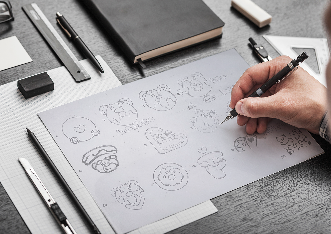
Early research focused on defining the brand personality, visual tone, and the relationship between the mascot and the product. Sketching was used to explore different ideas for the character, shapes, and visual elements that could represent the brand effectively.
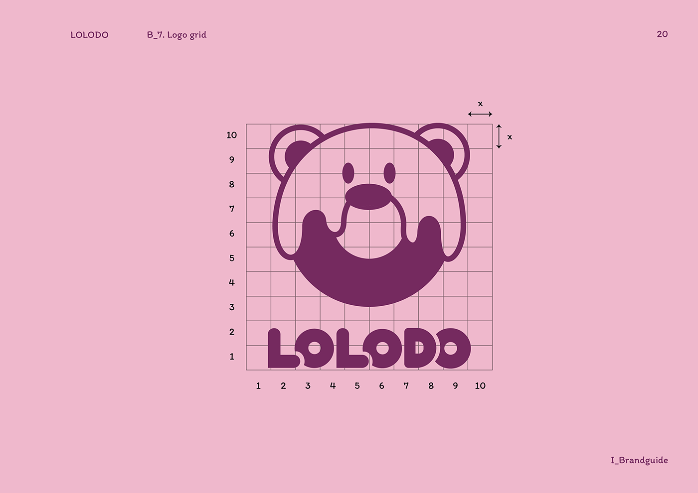
Through multiple sketches and visual experiments, the concept gradually evolved into a cohesive identity centered around Loy as the brand mascot and donuts as a symbol of shared happiness.
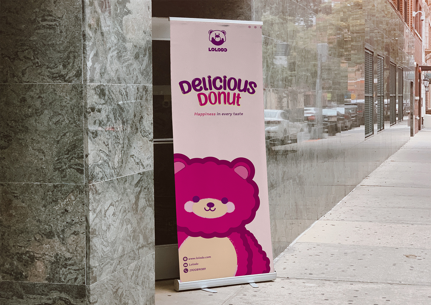
LOLODO is a donut brand inspired by a small burgundy-pink bear named Loy. The story begins when Loy, a beloved companion of a little girl, is accidentally forgotten somewhere. Every weekend, they used to share donuts together — a small moment that became the happiest memory for him.
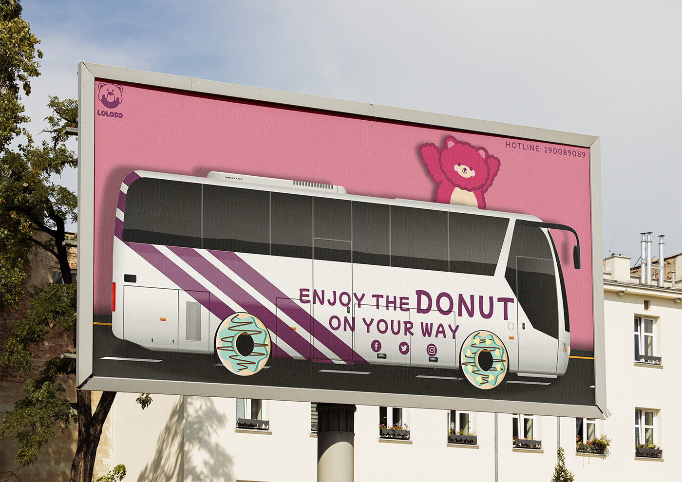
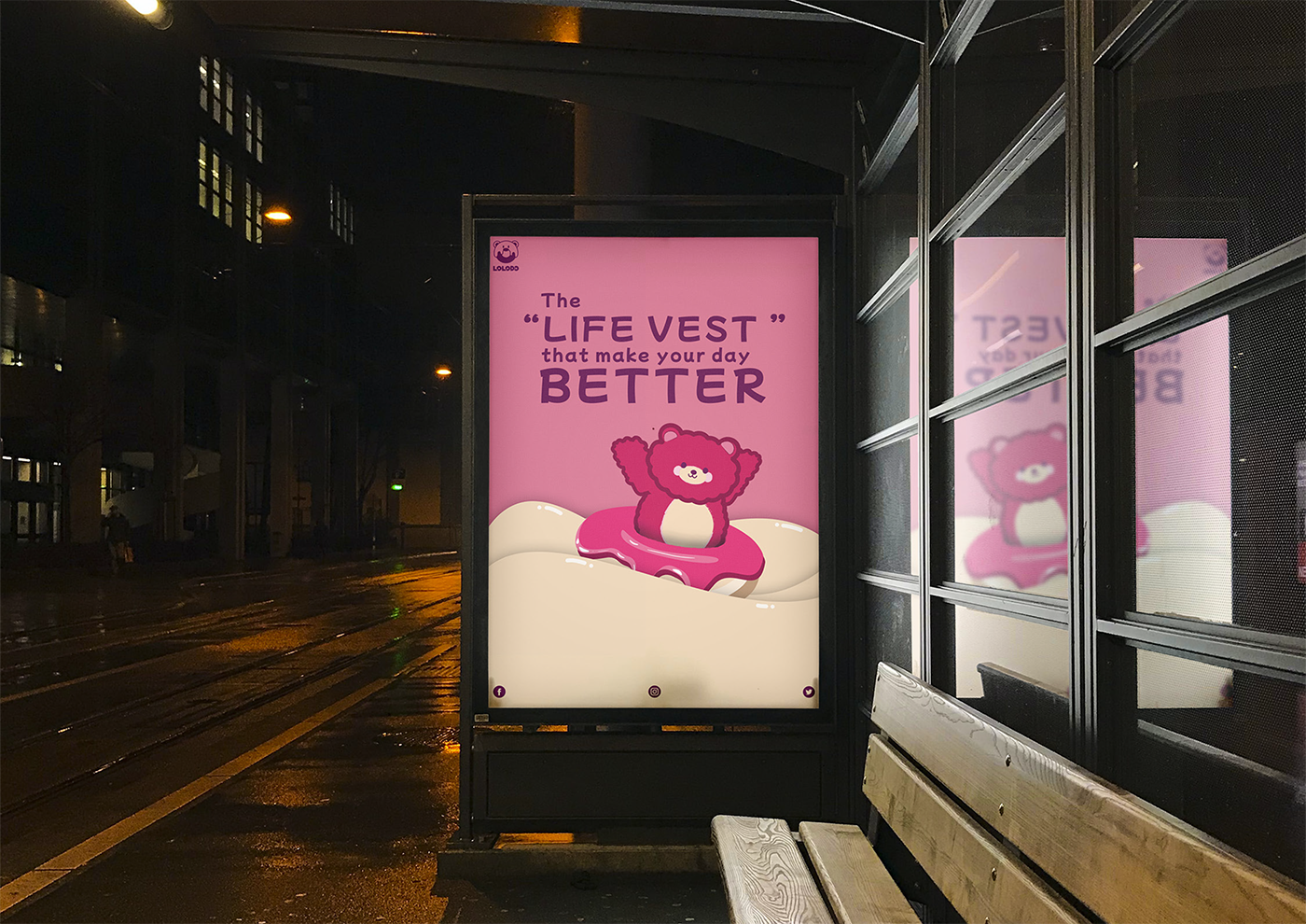
From this story, LOLODO was created as a brand that represents warmth, sweetness, and companionship. The mascot Loy symbolizes love and comfort, while donuts represent the energy of sharing happiness.
Through its playful and friendly identity, LOLODO aims to bring a sense of joy and emotional connection to every customer.
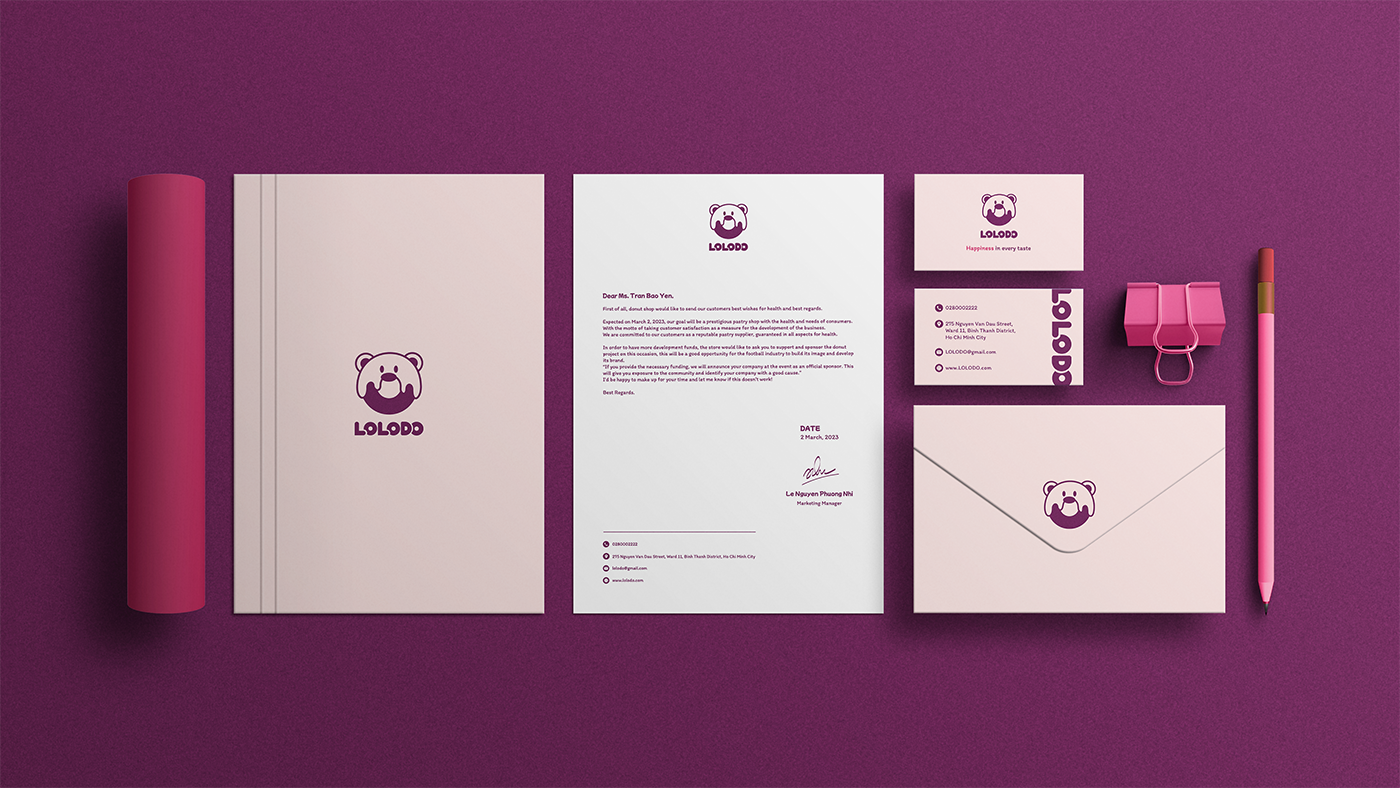
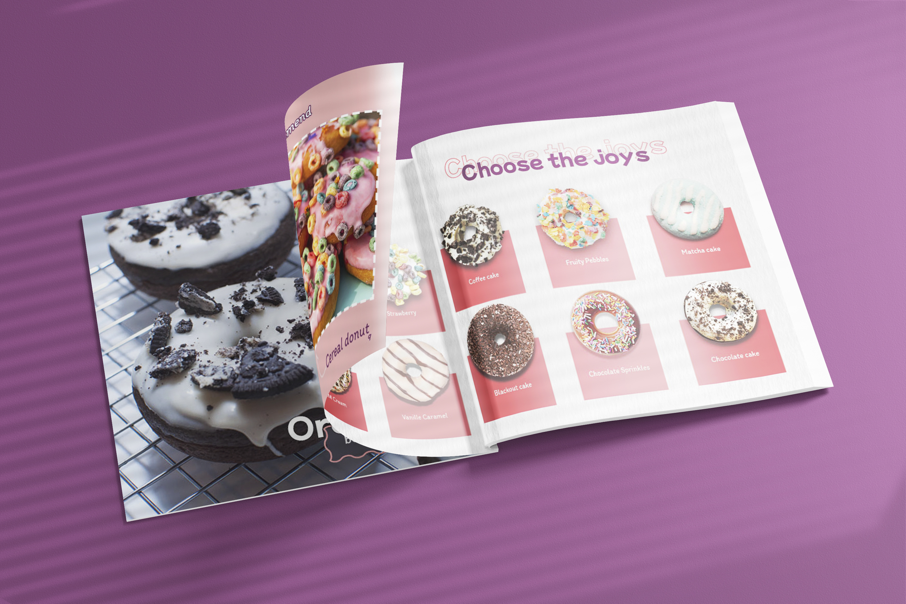
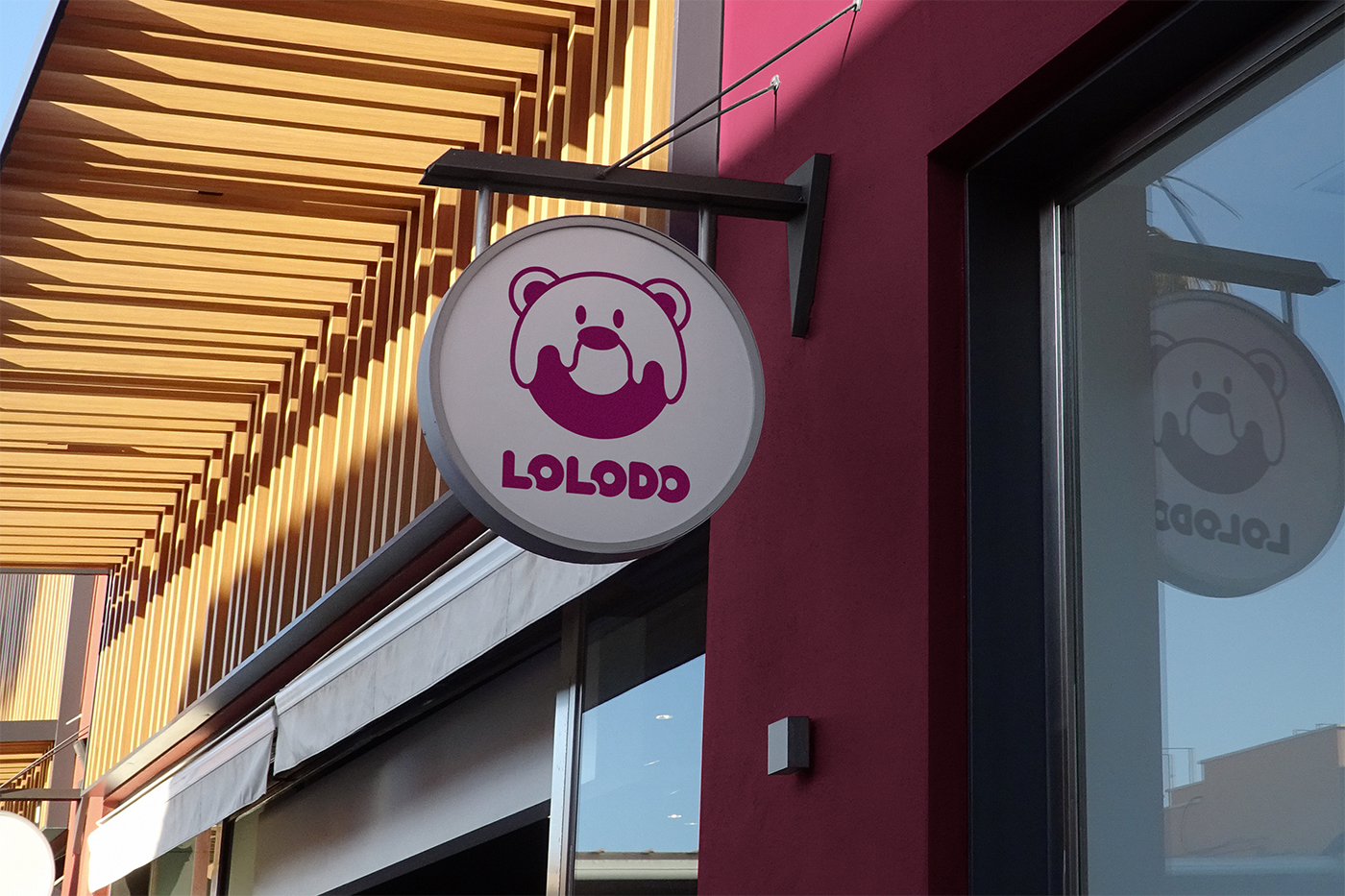
A collection of posters, mockups, and motion visuals presenting the final identity system.